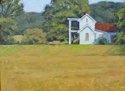


Here's the lesser of what I call a demo rating system. Class C is photos, Class B is video, and Class A is being there in person. I have been asked to post this kinda' thing from time to time and if I remember to photograph it it's easy to do. I just tend to get caught up in the painting and forget the photos. I just have to get better at photos. These look crooked and distorted for some reason I can't explain and a lot of the really nice fine textures and strokes are blown out and gone. I'll keep practicing. But this will give you an idea of how I start and proceed with my paintings regardless of the quality of the photos. This is a 9x12 and I finished in about an hour and a half. I paint on a real slick gessoboard made by Ampersand and I use tiny little round brushes, hog bristle.
Also, I talked to a couple of people over the weekend about approaching artists with trade secrets and questions. I have found most of the artist's in the art community will share about anything on how they do what they do. It is a very giving and generous group. So don't be afraid to ask what you would consider "stupid" questions because 90% of us asked the same question at some point in our career. If you get a jerk, move on. There are plenty of artist out there who will help.
As far as my trade secrets to a good painting here they are:
Solid drawing, values, values, values.
Repeat.
I am not much of a colorist. I am more concerned with sticking the values and then I see color as temperature more than color. I compare what I am trying to apply to the areas around it and decide if it is warmer or cooler or lighter or darker. I will then push the pile of paint in my palette in that direction. I don't see Sap Green per say. I see a pile of paint that needs to have more red in it and needs to be a bit darker so will probably get a bit of ultramarine until I get the relationship between it and the color or value next to it. For instance, in the little round bush in the middle, to get it, I compared what I wanted to the green in the big tree and decided it needed to be warmer and a bit lighter. Add red, yellow and white a little at a time until it is the green you want in relation to the green of the other tree. Oh, and by the way, I use Cadmium Scarlet, Cadmium Lemon, and Ultramarine with Titanium White. That's it. So again, I don't see them as designated colors, I see a mixture of these three paints pushed in the direction I need. Took me for ever to latch on to this but once I did it made it soooo much easier for me. But again, it took a lot of experimenting and painting and watching and asking other artists to get to this point. There are a lot of directions and methods to get to a good painting and you will have to take that journey yourself.


