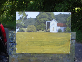


Here's the lesser of what I call a demo rating system. Class C is photos, Class B is video, and Class A is being there in person. I have been asked to post this kinda' thing from time to time and if I remember to photograph it it's easy to do. I just tend to get caught up in the painting and forget the photos. I just have to get better at photos. These look crooked and distorted for some reason I can't explain and a lot of the really nice fine textures and strokes are blown out and gone. I'll keep practicing. But this will give you an idea of how I start and proceed with my paintings regardless of the quality of the photos. This is a 9x12 and I finished in about an hour and a half. I paint on a real slick gessoboard made by Ampersand and I use tiny little round brushes, hog bristle.
Also, I talked to a couple of people over the weekend about approaching artists with trade secrets and questions. I have found most of the artist's in the art community will share about anything on how they do what they do. It is a very giving and generous group. So don't be afraid to ask what you would consider "stupid" questions because 90% of us asked the same question at some point in our career. If you get a jerk, move on. There are plenty of artist out there who will help.
As far as my trade secrets to a good painting here they are:
Solid drawing, values, values, values.
Repeat.
I am not much of a colorist. I am more concerned with sticking the values and then I see color as temperature more than color. I compare what I am trying to apply to the areas around it and decide if it is warmer or cooler or lighter or darker. I will then push the pile of paint in my palette in that direction. I don't see Sap Green per say. I see a pile of paint that needs to have more red in it and needs to be a bit darker so will probably get a bit of ultramarine until I get the relationship between it and the color or value next to it. For instance, in the little round bush in the middle, to get it, I compared what I wanted to the green in the big tree and decided it needed to be warmer and a bit lighter. Add red, yellow and white a little at a time until it is the green you want in relation to the green of the other tree. Oh, and by the way, I use Cadmium Scarlet, Cadmium Lemon, and Ultramarine with Titanium White. That's it. So again, I don't see them as designated colors, I see a mixture of these three paints pushed in the direction I need. Took me for ever to latch on to this but once I did it made it soooo much easier for me. But again, it took a lot of experimenting and painting and watching and asking other artists to get to this point. There are a lot of directions and methods to get to a good painting and you will have to take that journey yourself.
It's nice to see the demo Kevin and the advice on colour/value mixing is useful. I think I'm guilty of mixing to a formula sometimes, so I'll bear in mind what you say.
ReplyDeleteThanks indeed, very useful this post!
ReplyDeleteTwo stupid question then, ... you asked for it hehehe
one: Is there a reason to put the horizon exactly on the edge of your box?
two: Why are you putting the color on your palette the way you do, a silly question maybe but usually you'll see the colors put down differently. ((from left to right))white, yellow, red and blue)
Rene-Nope. In both cases it was entirely a fluke. The palette colors laid out that way was something I had seen when I began this and just copied it. There is no particular reason. I guess it is just whatever you get used to.
ReplyDeletegreat post today!
ReplyDeleteAha! Now that I know your secrets... you better watch out!
ReplyDelete... yeah, right... : )
One thing you could add to this is a photo of the scene you are painting. I found it very interesting on your last post to see the photo of that tiny little barn you made a painting of.
ReplyDeleteCan do. I'll do another next week with the reference. When I shot that storm I didn't realize the barns were in the photo until I saw it on the computer.
ReplyDeleteOkay then, ...
ReplyDeleteWe don't want to get the idea that it's just painted by imagination, do we? (lol)
About the palette, usually they put the white is where you have the blue because the blue has much more staining power, and this way you tend to get it onto you cloths a lot more easily.
Looking forward to next week!
THAAAT's why I keep wearing the blue home! I got it on a zipper pull one day and could not figure out where it was coming from. By the time I had figured it out I had it all over my truck, my home, everything.
ReplyDeleteHi Kevin,
ReplyDeleteI just wanted to know, do you know Kevin McPherson, I guess you do so you should also know his palette.
I was wondering why you use Cadm. Scarlet and Cadm. Lemon?
I'll thinking of giving it a try, and would like to know if you ever used Cadm.Yellow light and alizarin crimson, and what you think of that. It's seems that your greens and yellows are much vibrant, ...